Showing posts with label Photoshop. Show all posts

Wednesday, May 2, 2012

Tutorial 5: Basic Photo Editing (Ladscape)


Welcome to Tutorial 5!

If you want to learn digital scrapbooking and this is your first time, go to the side panel and click on the ad that says “Start Your Tutorial Here”. If you just want to take Basic Photo Editing, click here to go to Tutorial 4. 

Last week, we learned the basics of portrait editing which were:
Step 1: Brightening & Increasing Contrast
Step 2: Blemish Removal
Step 3: Enhancing Colors

Today, we’re going to learn the basics of landscape editing which are:
Step 1: Equalizing Exposure/ Lasso Tool & Curves Tool
Step 2: Brightening & Increasing Contrast
Step 3: Enhancing Colors/ Desaturation Tool
Step 4: Balancing Colors

Let’s start with this photo. You may download this photo to practice or you may pull up your own photo in Photoshop and follow these steps.


About the photo, this was taken in Santa, Ilocos Sur, Philippines. It’s supposed to be one of the best views I’ve ever seen, but I guess the photo doesn’t say so just yet! Let’s see if it is, after the tutorial!


STEP 1: EQUALIZING  EXPOSURE

You’re probably wondering why we didn’t just go straight to Brightening & Increasing Contrast. The reason we need to equalize the exposure of the photo is that there are details we’d like to preserve. 

Chances are, if you go straight to Brightening & Increasing Contrast, you might lose the details of the clouds and you’ll  be left with nothing but a white sky. And we don’t want that. 

So in this Step you’ll learn how to use the Polygonal Lasso and the Curve Tool.

Let’s start by using the Polygonal Lasso Tool, at the  left tool palette. See screenshot below. 


It’s the second among three tools with the same function. The reason we use this instead of the lasso tool is, this is so much easier to manipulate. Once you’ve chosen the tool, we will equalize the exposure of the sky with the landscape below it.


Using the Polygonal lasso, click on the edge of the mountain and then slowly trace down to the edges of the picture. And then seal the polygon to the part where you started. The finished polygon should look much like the screenshot. Take note that it does not have to be perfect.


Once you seal the polygon, right click inside it and then choose feather. Once you choose feather, a pop up will appear.


The pop up will ask you to choose a feather selection as to the number of pixels. For a 30 inch photo with 72 pixels per inch, a good feather selection amount would be 50 and lesser for smaller pictures.

What does this tool do?

It blends the changes in the polygon with the outside so that there is no clear line in between the two.

After that go to Image>Adjustments>Curves


This tool is great at manipulating exposures. It can lighten an image without sacrificing the amount of shadows and contrast of the photo. Our aim is to lighten the landscape within the polygon. This pop up will then appear.


Put you cursor to the very center of the line and then drag it up or down and see how the exposure changes. Amazing right? If you make a mistake, just click Ctrl + Z. For this photo let us do this. See screenshot. You may copy the input and output figures on the screenshot to equalize the photo.


Once done, right click in the polygon and choose Deselect to move on to the next tool.


STEP 2: BRIGHTENING & INCREASING CONTRAST

We’ve covered this is Tutorial 4 but let’s go easy on the Brightness & Contrast Tool for landscape photos.

Now go to Image> Adjustments> Brightness & Contrast. Yu may copy the settings on the brightness screenshot to achieve the right brightness and contrast.


Again, be warned, the amount of brightness and contrast may differ for different versions of Photoshop. CS2 may be brighter and the contrast higher than the same number in CS3 or CS5.


STEP 3: ENHANCING COLORS

In Tutorial 4 we learned how to enhance the colors by clicking Image> Adjustments> Hue Saturation. We also learned the use of the three options in the tool. For this photo we are also going to use the Saturation Tool only and leave out the other two. You may follow the adjustments on the screenshot.


By now, you’re probably already contented with what you see. Isn’t it an awesome view?

You may save the photo at this stage for we will proceed into something a bit radical!  

Indeed we can stop the tutorial here, but that’s going to be a little boring isn’t it?

How about one more tool in the color enhancements field?

Let’s try the Desaturation Tool! Go to Image> Adjustments> Desaturate.


Automatically it will turn your photo into black and white.


STEP 4: BALANCING COLORS

You’re probably shocked how your photo turned out. Bet you’re glad you saved the photo before hitting the Desaturate Tool!

Now don’t fret! There’s more to black and white than you might think! Let me teach you my very own concoction of Vintage style photo, which is also the last part of the tutorial.

First, go to Image> Adjustments> Photo Filter.

By default, the photo filter is set at 25%. So just hit OK.

The photo filter tool was made to imitate the photo filters that you put on the lens of a DSLR camera to equalize the amount of light that enters the aperture. Photo filters come in plain and warming colors (e.g. blue, green, red, orange, yellow, black etc.). By default Photoshop uses orange warming filters.

Second, go to Image> Adjustments> Color Balance.


The image colors are divided into three sections, Shadows, Midtones and Highlights. With each section containing six main colors. On the left side there is Cyan, Magenta and Yellow and the other side there is Red, Green and Blue.

Click on the Shadows option first and then follow the adjustments on the screenshot.

And then choose Midtones next. Follow the adjustments on the screenshot as well.


Lastly, choose Highlights and follow the adjustments on the screenshot!


And voila you have your very own Vintage landscape photo! 

But wait, that’s not it! Let’s make the photo more vintage. Let’s add some burnt/darkened edges.

Go to the tool palette to the left and then choose Burn Tool. 


Once you’ve chosen the Burn tool, right click on the image so that we can adjust the size of the brush, like what we did with the spot-healing brush tool in Tutorial 4. Make sure that the brush is set, like in the screenshot. And the Exposure (see green arrow) is set at 100%.


Slowly burn the edges of the photo. You may repeat the process three times, until you achieve the right tone. On the screenshot below, I repeated it five times! Lol So you may do the same!


That ends our tutorial for today! The Vintage Style is, actually, for our next tutorial, which is on Vintage Theme Scrapbooking!

Feel free to comment if you have questions or suggestions. And please rate this tutorial if you think it was interesting, useful, difficult or fun! (see buttons below).


A LOOK INTO WHAT’S NEXT: Let’s do a vintage theme scrapbook! And maybe a free kit and more!

Wednesday, April 25, 2012

Tutorial 4: Basic Photo Editing (Portrait)


Welcome to Tutorial 4!

If this is your first time, please go onto the side panel and click on the link to tutorial 1!

It's been a while since my last tutorial and a lot has definitely changed. When I started out the tutorial, I was still tutoring (lol) English & English Cultures to would-be contact center agents and now I am a full-fledged graphic designer (please visit my website and LIKE my facebook page!). This also means that I now have full control of my time and I can blog anytime I like.

So! As promised in Tutorial 3 (ages ago), I will teach you some basic photo editing.
Now that you know how to put together a digital scrapbook, I know you also want to make your photos look well with the rest of the elements in the digi-scrap.

If you don’t own a DSLR camera, sometimes the pictures are too dark or too hazy and the contrast is a bit off. Don’t worry about it, that’s what this tutorial will be all about! Trust me! I put up with a point-and-shoot camera for over a year. That dilemma forced me to learn Photoshop so I could achieve the photo composition that I like.

Today, we will start with a basic portrait. This is my photo, you can download and practice on it too, just don’t make me look funny! (lol) Or you can open your own photo and follow these procedures.


STEP 1: BRIGHTENING & INCREASING CONTRAST

Open the photo in Photoshop. As you noticed, the photo is a bit dark and the colors are a bit muted. 


So what you do is, click on IMAGE > ADJUSTMENTS > Brightness/Contrast. A pop up will open where you can toggle to adjust the brightness and contrast.


If you’re using Photoshop CS2, the difference of each level of brightness is huge, so when you toggle the brightness to +15 you might get a brighter result than the same number in CS3 or CS5.

So now it really depends on your eyes!

Now that you’ve made the image brighter, sometimes it makes the image hazy and the colors are too light. So you’d also wish to adjust the Contrast to make the colors come out. So toggle to the contrast that you like.


Once you’ve achieved the desired brightness and contrast hit ENTER or OK on the pop-up box.


STEP 2: BLEMISH REMOVAL
Now that your photo is brighter and the contrast is higher, a new problem arises. Your freckles are more defined and every rash (even the tiniest) is obvious! The main reason that people use Photoshop is because of its blemish-removal tool which isn’t as expensive as Proactiv but is just as effective!


What tool is it? WRONG! The question should be –Which tools are it?!
You have four main blemish-removal tools which will be found on the left tool panel. If you right click on the band-aid button you’ll see them. See screenshot
a.      Spot Healing Brush Tool
b.      Healing Brush Tool
c.      Patch Tool
d.      Red Eye Tool

Now what do these tools do?
SPOT HEALING BRUSH TOOL – is the basic anti-blemish tool. It will automatically erase dark spots on your face. If you click on the tool you can adjust the size of the brush by right-clicking and toggling on the pop up box. This is important since you’d like enough coverage on the spot you’d like to remove. See screenshot below.

When you right-click and the pop up box opens you’ll see three basic options to adjust the Spot Healing Brush tool: Diameter -adjusts the size of the brush; Hardness –adjusts the edges of the brush, always make sure it’s low enough to make the brush blend in easily; Spacing –which also determines the efficiency of the tool, always set it at 25-50% to make sure the brush blends in easily.
You may copy the settings on the screenshot and start clicking on the spots you see on the picture and see a miracle unfold! See the difference.


HEALING BRUSH TOOL – is an even more amazing tool. Sometimes the blemish is bigger than a spot, then this tool will do it for you! The adjustments of this tool are similar to Spot Healing tool. What this does is, it copies a spot on the face to the blemished spot, to cover it with the desired tone or color.
What you do is hold down ALT and click on the spot you desire to cover a certain blemish. And then click on the blemish you’d like concealed.
Now, on my picture you’ll see a mark from a nose piercing I got in college and I’d like that to be gone. So I click on a portion of my skin that’s clean and then I put that on the mark. And voila it’s gone!

See the difference. Cool isn’t it?
PATCH TOOL –is for larger spots but you really wouldn’t use this if you’re working on a portrait.
RED-EYE TOOL –is another miracle tool that removes the red-eye caused by strong flash photography. This has a tendency to darken eye color, so be warned. I suggest that you prevent “red-eye” by adjusting your camera flash to “slow synch” to delay the flash when the shutter closes, if you’re using a DSLR camera, then get a flash diffuser.

STEP 3: ENHANCING THE COLORS
Now that your photo is brighter and blemish-free, sometimes the colors are inadequate and you’d like to make the photo pop some more. The tool for the trick is HUE/SATURATION. Click on IMAGE > ADJUSTMENTS > Hue/Saturation.


A pop-up box will then appear. You’ll see three choices: Hue –which adjusts the most predominant color, if you’d like to look like the Navi in Avatar then you can toggle to make the dominant color blue, if you also want to look like Fiona or Shrek then make green as a predominant color, but if you want to look normal, I suggest you leave it at zero! See first screenshot belowSaturation –adjusts the strength of all the colors, now this is the right tool to toggle!; Lightness –is the opposite of the Saturation tool, this also works like the brightness tool used in Step 1.

Now that you’ve toggled on the color saturation, see the difference!


That concludes today’s tutorial on basic photo-editing.

Feel free to comment if you have questions. And please rate this tutorial, if you think it's interesting, difficult, useful or fun! (see buttons below)


A LOOK INTO WHAT'S NEXT: We're not done with photo-editing, there are a few more tricks, so keep your scappin' happy fingers ready! 


Friday, June 3, 2011

Tutorial 2: Filetypes and Filetype Conversion


Welcome to Tutorial 2!

If  this is your first time to visit, please click on the button to the right side of this page that says “Start you tutorials here!”.

In Tutorial 1 we talked about your work area and a little about "Filetypes". By now, you should have an idea of how quite time-consuming “digital scrapbooking” is. Just looking for graphics and it already takes a long time but your hardwork will definitely payoff! Just you wait!

On this tutorial we’re going to learn more about FILETYPES.

The previous tutorial tackled PNG, jpeg, psd and tiff, as the file we will be using in this craft and that 90% of the time PNG is what we use because of it’s transparent background. I also mentioned that MOST PNG files are transparent but—NOT ALL! If you did your exercise on Tutorial 1, you must’ve already figured that out.


BUT there’s a way for us to turn PNG files with background into genuine PNG files!

Here’s how!

Remember that what we’re removing is the background, because we want to be able to paste them on top of the other like this:
But can you paste it if your PNG file looks like this?


PLEASE NOTE: All backgrounds could be removed but you might sacrifice the quality of the image. Go for graphics that have a “solid-color” background, meaning their background is just one color and not texturized. Please see image below:


So how do you remove the background?

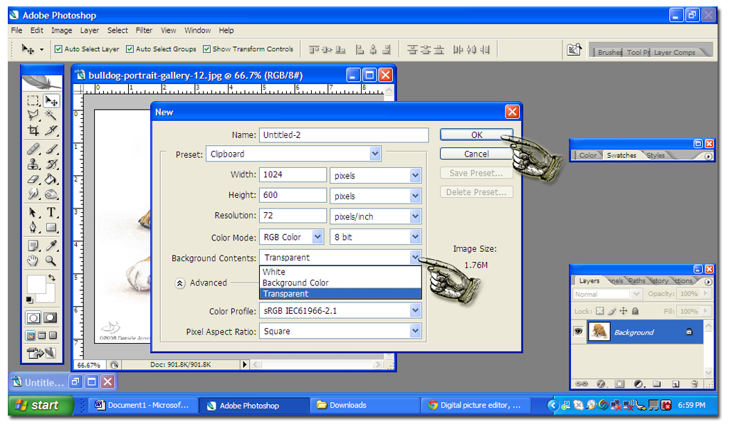
1. Open the file in Photoshop.


2. And then click on File > New to open a new document. A pop up will then appear that will show you the size and the properties of this new document you’re opening. Make sure you click on Background Contents and choose Transparent. 


3. And then the new document should look like this. A transparent background should look checkered. 


4. Minimize your picture screens to make sure you see everything in your window. Now you should see both the bulldog’s picture and your new document.

5. Click on the Magic wand tool to your left. And then click on the white background that you want to remove. Doing that will highlight the white background.


6. Right click on the white background so that a dropdown menu appears.


7. Choose Select Inverse so that this time the bulldog is highlighted. 

8. Then click on Move Tool to your left.


9. Using the move tool, drag the bulldog into the new transparent document.


10. To clean up the image, use the Eraser Tool to your left. Now you have a transparent image!


11. Since the new document is too big, use the Crop tool to make it smaller. And then hold it down to the image until you get the right size. Right click it and then choose Crop. 


12. Now it’s done! You may save the image by clicking File and then Save As and make sure you choose PNG as the filetype.

13. So let’s say you have a fancy background. Open it in Photoshop and then, using the move tool, drag the bulldog image into the fancy background for it to look like this. Isn’t it awesome!


Okay, so we already know how to remove the background from “False PNG’s”, but you know what? I HAVE GOOD NEWS FOR YOU! Now that you know how to remove the background you can do it on ANY FILETYPE, whether the image is jpeg or tiff you can always remove the background by doing the same thing! 


MORE ABOUT FILETYPES:

  • JPEG- is what most pictures are. Most great quality pictures are in jpeg format.


  • TIFF - is usually for high-definition and large photos. Saving images in TIFF format preserves the sharpness of the image, but it also takes a lot of space in your computer memory.


  • PSD - is a Photoshop-specific picture format, where all layers are preserved the way they are. Usually, if you're editing an image in Photoshop and you have multiple layers, but you couldn't finish it yet, you can always save it as PSD. In this format the layers are not merged into a flat image like the JPEG, TIFF and PNG. Now, I know this sounds very technical, but let me explain this in English, if you look at the screenshot on Number 13 in the Tutorial you'll see that the bulldog image was dragged into the fancy background. The bulldog is a PNG file and the fancy background is a JPEG file. The background is LAYER 1 and then the bulldog is LAYER 2 and that's what I mean by LAYERS. Sometimes you want to put more images, like flowers or balloons, but you have to postpone it for the next day. You can save the file as PSD so that you can still manipulate the layers, like, transfer the bulldog to the other side of the background when you finally decide to put flowers on the side where the bulldog was. If you don't save it as PSD, the bulldog will never be movable because LAYER 1 and LAYER 2 will automatically be merged.


EXERCISE: Download images from Google and experiment on putting together different images by converting them to PNG format. Your background could stay as JPEG since it's just where you paste the PNG images. Enjoy! 

I hope this was very useful!

Please rate this tutorial if you find it interesting, fun, useful or difficult! (see buttons below)

Thanks guys!


Please note that all layouts are custom-made by Meg Jocson and Kick-Ass Ads.


A LOOK INTO WHAT'S NEXT: We're going to practice making a "Digital Scrapbook with all the elements to help you do it yourself. These elements are images that are readily downloadable but definitely needs conversion into PNG! "That's what's next!


Thursday, June 2, 2011

Tutorial 1: Your Work Area And An Intro To Filetypes


This might be your first time in "Digital Scrapbooking" so we will start with the very basic, which is the work area. 

"Digital Scrapbooking" is time-consuming at first and when I say time-consuming, I mean it! And even more time-consuming for people with (metaphorical) OCD, like me. 

  • Start with a well-organized area, like a chair and a laptop computer! (haha--I know!) But kidding aside, since we're foreseeing long work hours, you need to be comfortable. Occassional standing and stretching should be done at least twice an hour so that you won't strain your back or develop carpal tunnel.


  • As soon as all the hardware is set, it's time the ball rolls! You must have the Photoshop software, enough memory space in your computer and, ofcourse, a good internet connection.


Scrapbooking 101: 
  • To give you an idea, this is how my screen looks like:

You might feel puzzled but don't fuss, your screen will definitely look like this in the next tutorials! :)

  • What you can see on my screenshot is Photoshop and a bunch of graphics. You can customize your graphics, as I do (...and I will teach you how) but since you're just on Tutorial #1, you can always use ready-made graphics. This means that Google will be your "numero uno" bestfriend, if it's not your bestfriend yet. :)
www.google.com

  • But it is not as simple as clicking google images and typing what you want to look for, you have to know "FILETYPES". My screenshot shows graphics that are all transparent, meaning, when you copy and paste them on top of the other, you don't get that icky white background. Look at the Smiley below. The one to your left definitely has that white background but the one to your right doesn't and it's definitely the way to go!


  • FILETYPES: There are different filetypes; there's PNG, jpeg, psd, tiff and so many more, which you don't have to mind because we won't use them. Now, the filetype which we will use 90% of the time, due to it's transparent background, is "PNG"


  • When you type your query on Google there is no telling what kind of file types will come out, so you need to make sure Google comes up with purely PNG files.


  • So now the question is: How do you make sure Google shows you purely PNG graphics? SIMPLE. When you go to Google Images, type your query and then click on Advance search.


Follow the red arrow. :)

  • Look for the one that says Filetype and click on the dropdown menu. And then choose PNG.


And then that's how you find your graphics!

You may test the graphics by opening it in Photoshop and they would look a lot like the very first screenshot. Now just a piece of advice, most PNG file types are transparent but --not all. Don't get frustrated if your first attempt wasn't right. Google will definitely find the perfect one for you!

EXERCISE: Right now you can explore Google and what it offers. If you find good PNG graphics, experiment on them using Photoshop. Open a graphic in Photoshop and then click Ctrl+A. Then try to drag the graphics where you want them to be. 


I hope I made it easy for you, but this tutorial wasn't easy to make, I tell ya! 
Hopefully you find this very useful. 

Please rate this tutorial if you find it interesting, fun, useful or difficult! (see buttons below)

Thanks guys!

Please note that all layouts are custom-made by Meg Jocson and Kick-Ass Ads.

A LOOK INTO WHAT'S NEXT: Most PNG file types are transparent but again--not all. But there's a way to turn other filetypes into PNG! That's what's next!